Color is one of the first things customers notice on packaging. A small color difference can make a box look cheaper, less professional or different from your brand image.
When ordering custom packaging, many buyers ask the same question:
Should we use CMYK printing or Pantone printing?
The answer depends on your artwork, brand color requirement, budget and packaging material. CMYK is good for full-color designs. Pantone is better when you need a specific brand color to stay more consistent.
This guide explains the difference in a simple way, so you can choose the right printing method for your custom packaging boxes.
Why Printing Color Choice Matters for Custom Packaging Boxes
Packaging color affects brand recognition.
If your logo color, background color or product line color changes too much from batch to batch, customers may notice it. This is especially important for retail packaging, luxury boxes and brand packaging with fixed colors.
The right printing method can help your packaging look more consistent and professional.
Color choice can affect:
Brand appearance
Shelf display
Product line consistency
Printing cost
Sample approval
Bulk production result
So before production, it is better to confirm whether CMYK or Pantone is more suitable for your design.
What Is CMYK Printing for Packaging Boxes?
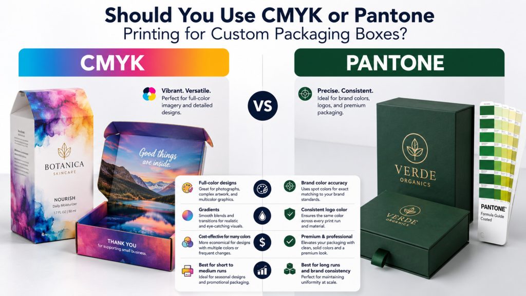
CMYK printing uses four basic colors: cyan, magenta, yellow and black.
These four colors are mixed during printing to create many different colors. CMYK is commonly used for packaging with photos, colorful patterns, gradients and detailed artwork.
For example, if your box has product images, colorful illustrations or a full-background design, CMYK printing is usually a practical choice.
CMYK is also commonly used for custom printed mailer boxes, folding cartons and many retail packaging boxes because it works well for full-color designs.
When Should You Choose CMYK Printing?
CMYK printing is a good choice when your packaging design has many colors or detailed images.
It is suitable for:
Full-color artwork
Product photos
Gradient backgrounds
Colorful patterns
Retail packaging
E-commerce packaging
Seasonal packaging designs
CMYK is also a common option when the budget needs to be controlled. For many packaging projects, CMYK can give a good visual result without using special spot colors.
However, CMYK may not always match a specific brand color perfectly. If your brand has a very strict logo color, Pantone may be a better option.
What Is Pantone Printing for Packaging Boxes?
Pantone printing uses a specific spot color based on a Pantone color code.
Instead of mixing colors from CMYK, Pantone uses a fixed color formula. This makes it easier to keep brand colors more stable across different packaging batches.
Pantone is often used for logos, brand colors, large solid color areas and simple premium designs.
For example, if your brand color is a specific blue, green, red or gold tone, Pantone printing can help keep the color closer to your standard.
When Should You Choose Pantone Printing?
Pantone printing is a better choice when color accuracy is important.
It is suitable for:
Brand logo colors
Corporate packaging colors
Luxury packaging
Large solid color backgrounds
Minimal packaging designs
High-end gift boxes
Products that need strong color consistency
For premium packaging, Pantone can make the brand color look more controlled and stable. This is why many custom rigid gift boxes use Pantone colors for logos, background colors or special brand shades.
Pantone printing usually costs more than standard CMYK, but it can be worth it when brand color consistency matters.
CMYK vs Pantone: Which Option Is Better for Your Box Design?
There is no single best option for every packaging box. The better choice depends on your design.
| Packaging Need | Better Option |
|---|---|
| Full-color images | CMYK |
| Product photos | CMYK |
| Gradient design | CMYK |
| Lower regular printing cost | CMYK |
| Exact brand logo color | Pantone |
| Strong color consistency | Pantone |
| Large solid color area | Pantone |
| Premium brand packaging | Pantone or CMYK + Pantone |
Some packaging designs use both methods. For example, the main artwork can be printed in CMYK, while the logo or brand color can use Pantone.
This is common when the box needs both rich visual design and accurate brand color.
How Paper Material Affects Printed Color
The same color can look different on different paper materials.
White art paper gives a cleaner and brighter color result. Kraft paper makes colors look more natural and slightly darker. Textured paper can make the color feel softer. Black paper usually needs special printing methods for clear results.
Surface finishing can also change the final look.
Matte lamination can make colors look softer. Glossy lamination can make colors look brighter. Soft-touch lamination can make the surface feel more premium but may slightly change the color tone.
So even if you use the same CMYK value or Pantone code, the final result can change depending on the paper and finish.
Why Packaging Samples Are Important Before Bulk Printing
For custom packaging, samples are very important when color matters.
A digital design on screen is not the same as printed color on paper. Different screens, papers and finishes can all affect how the color looks.
A sample can help you check:
Logo color
Background color
Paper texture
Surface finish
Overall packaging effect
If your packaging uses a strict Pantone color, a sample is especially useful before bulk production.
For large orders, confirming a sample first can reduce the risk of color problems in mass production.
How to Choose Between CMYK and Pantone
You can use a simple rule:
Choose CMYK if your design has many colors, images, patterns or gradients.
Choose Pantone if your brand color must be more accurate and consistent.
Choose CMYK + Pantone if your packaging needs full-color artwork and a strict brand logo color.
For basic e-commerce packaging, CMYK is often enough. For premium packaging or fixed brand color systems, Pantone is usually better.
If your design also needs inside and outside printing, you can read our guide on inside printing or outside printing for custom mailer boxes to understand how printing layout affects the final packaging design.
Work With a Custom Packaging Box Manufacturer
Choosing CMYK or Pantone is easier when your artwork, material and quantity are clear.
Before production, it is better to confirm your box style, paper material, printing colors, Pantone code if available, surface finish and order quantity.
Yingye Packaging provides custom packaging boxes with CMYK printing, Pantone printing, logo printing, foil stamping, matte lamination and sample support. We help brands choose suitable printing options based on design, budget and production needs.
If you are not sure whether CMYK or Pantone is better for your packaging project, you can contact us and send your artwork or color requirement for review.
Conclusion
CMYK and Pantone printing are both useful for custom packaging boxes.
CMYK is practical for full-color designs, photos, gradients and regular packaging projects. Pantone is better for exact brand colors, logo colors and premium packaging that needs stronger color consistency.
The best choice depends on your design, material, budget and color requirement. If the color is important, always check a sample before bulk production.
FAQ
Is CMYK printing good for packaging boxes?
Yes. CMYK printing is good for packaging boxes with full-color artwork, product photos, patterns and gradient designs.
Is Pantone printing more accurate than CMYK?
Pantone printing is usually better for specific brand colors and stronger color consistency. It is often used for logos and fixed brand color systems.
Is Pantone printing more expensive than CMYK?
In many cases, Pantone printing costs more than standard CMYK printing. The final cost depends on the color, design, material and order quantity.
Can CMYK and Pantone be used together?
Yes. Some packaging designs use CMYK for full-color artwork and Pantone for the logo or brand color.
Why does printed color look different from my screen?
Screen color and printed color are different. Paper material, ink, lamination and lighting can all affect the final printed result. That is why samples are important before bulk production.