
One of the first decisions in any custom mailer box project is also one of the most underestimated: kraft or white? Buyers tend to treat it as a color preference. On the production floor, it is a substrate decision — and it changes how your artwork prints, how colors hold, what finishing options make sense, and where your budget actually goes.
This guide explains the real differences from a manufacturer’s point of view, so you can choose before you pay for plates, proofs, and production.
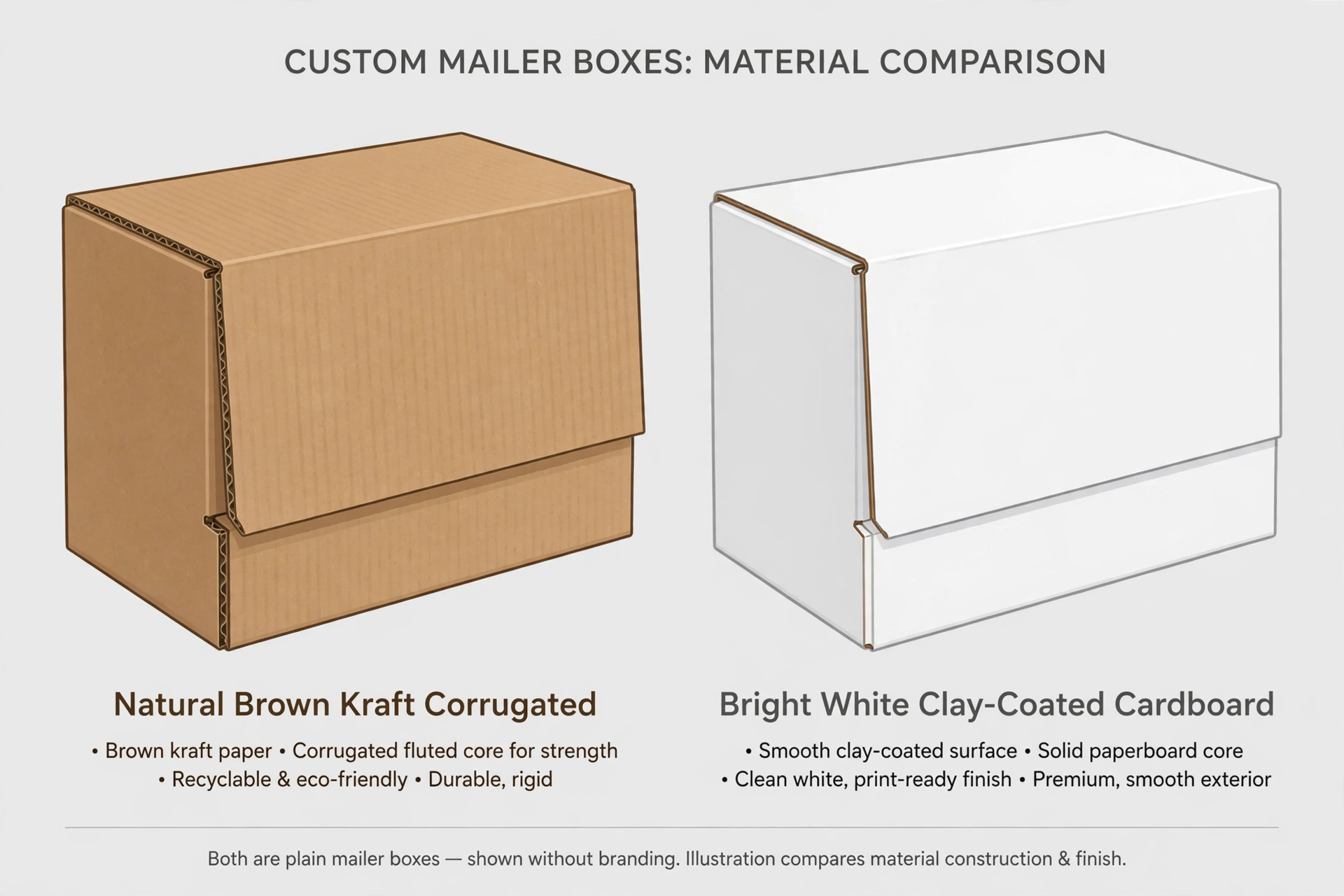
The Short Answer
Choose kraft if your brand leans natural, minimal, or eco-positioned, your design uses one or two ink colors (or dark colors on the brown base), and exact color matching is not critical.
Choose white if your design relies on full-color CMYK printing, photography, pastel or bright brand colors that must match precisely, or a clean premium finish.
Both substrates use the same corrugated structure underneath, so strength and protection are essentially equal. The differences are in print behavior, appearance, cost drivers, and brand perception — which is what the rest of this guide covers.
What “Kraft” and “White” Actually Mean in Production
When manufacturers say “kraft mailer,” they usually mean a box with an unbleached kraft liner — the brown, natural-fiber outer layer of the corrugated board. It is not dyed brown; that is the natural color of unbleached wood pulp.
“White mailer” usually means a clay-coated white liner (often called CCNB — clay-coated news back — or white top liner). A thin clay coating gives the surface a smooth, bright base that takes ink cleanly. Uncoated white kraft also exists and sits between the two in both appearance and print behavior.
This matters because you are not choosing a paint color. You are choosing the printing surface, and ink behaves very differently on each. (For a broader overview of board and liner options, see our paper material guide.)
Print Quality: Where the Difference Shows Most
This is the factor that causes the most disappointment when buyers choose wrong — and it is almost entirely predictable.
On kraft, the brown base acts as a permanent undertone. Light and bright colors shift: a sky blue prints more muted and earthy, pastels lose their lightness, and full-color photography looks dull because the brown base absorbs contrast. Dark, saturated colors — black, deep green, navy, burgundy — print well and can look striking against the natural brown.
If your design needs white text or white graphic elements on kraft, the printer must lay down a white ink underbase first, then print colors on top of it. That is an extra print pass: more setup, more time, more cost.
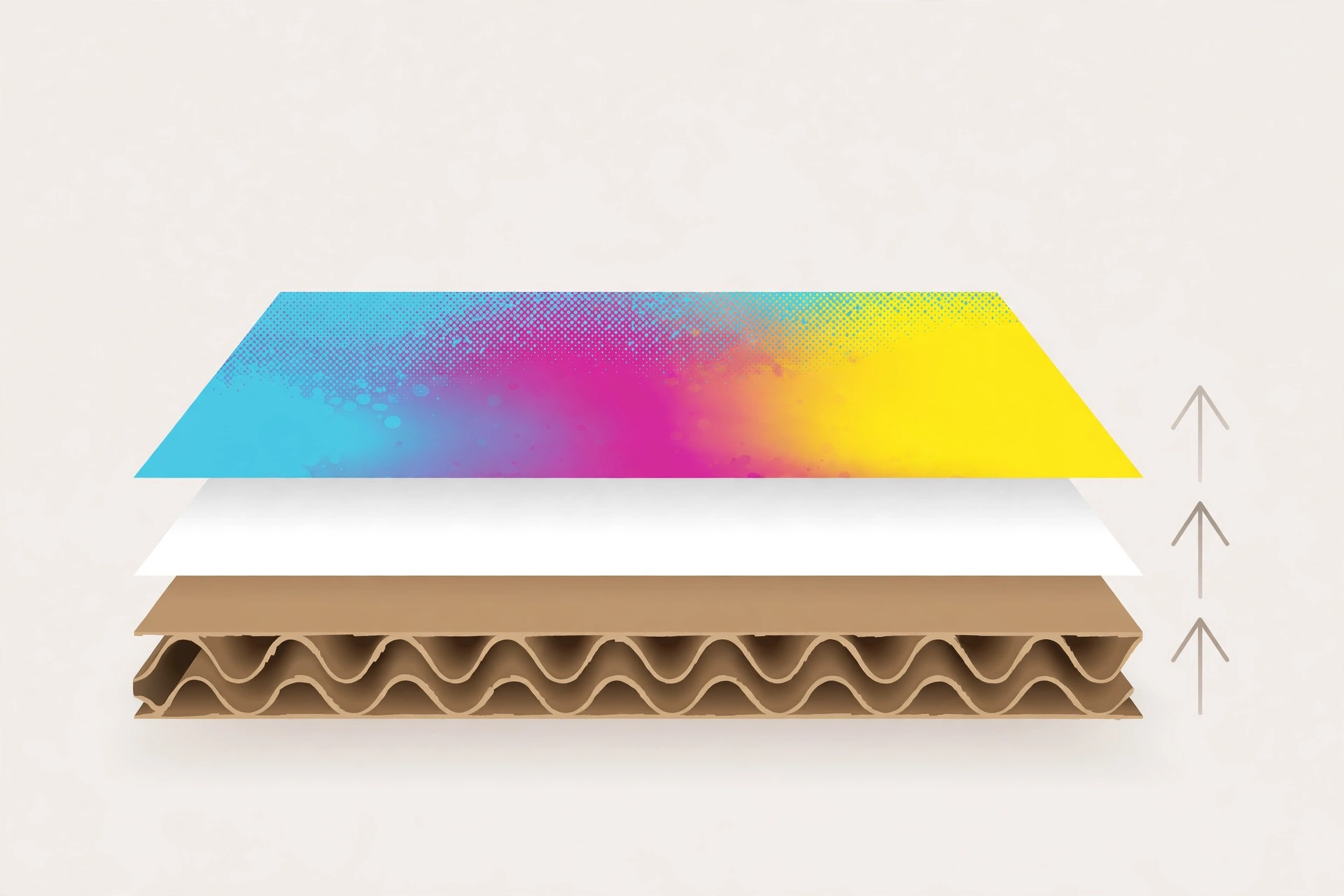
On white, ink starts from a neutral base. CMYK colors reproduce the way they look on screen, gradients stay smooth, photography holds detail, and Pantone spot colors match far more reliably. Fine typography stays crisp. If your packaging was designed digital-first, white is what makes that design survive the trip to print.
| Print scenario | Kraft | White |
|---|---|---|
| One- or two-color logo | Excellent — the brown base adds warmth and character | Clean and precise |
| Bold brand colors that must match | Difficult — colors shift toward earthy tones | Reliable — colors reproduce as specified |
| Photography or photorealistic print | Not recommended — brown base flattens contrast | Recommended — neutral base preserves detail |
| Pastels or light colors | Muted; white elements need a white underbase pass | Prints as designed, no extra pass |
| Foil stamping / spot UV | Strong contrast on the dark surface | Finishes stand out crisply |
| Fine detail and small type | Acceptable; porous surface softens edges slightly | Sharper — coated surface holds detail |
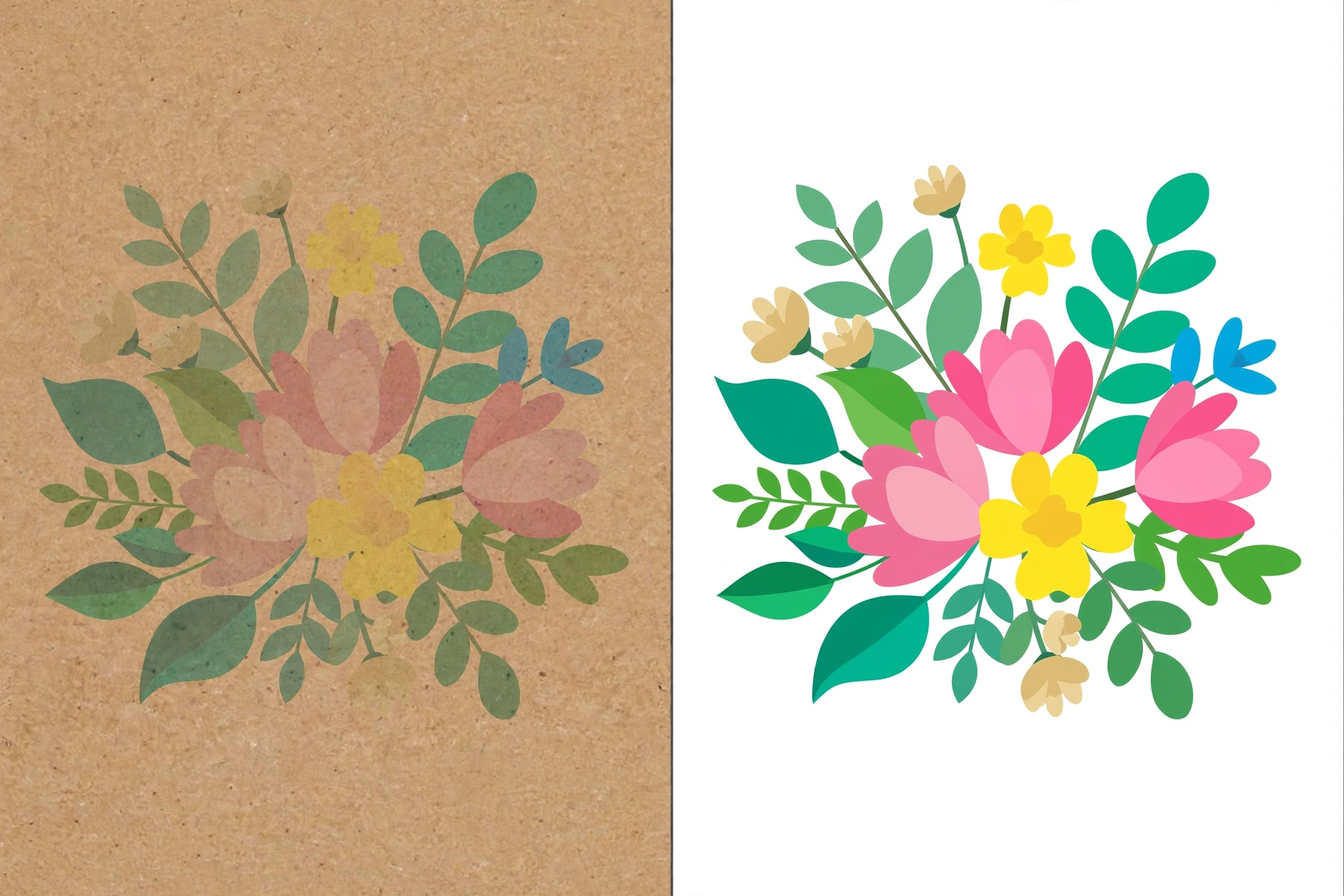
Practical note on color matching: if your brand has strict Pantone requirements, always request a physical printed proof on the actual substrate before approving mass production. A Pantone swatch book assumes a white base — on kraft, the same ink formula will not look the same. This is the single most common source of “the boxes don’t match our brand color” complaints, and it is entirely avoidable.
Cost: What Actually Drives the Price
Buyers often assume white costs significantly more than kraft. In practice, the substrate itself is rarely the main cost driver. At comparable board grades and order quantities, the material price difference between kraft and white liner is modest.
What actually moves your per-unit cost:
- Print passes. A one-color kraft box is economical. A kraft box with a white underbase plus four colors is not — you are paying for extra passes. On white, full-color CMYK is the standard single-pass process.
- Print coverage and placement. Printing the outside only is standard. Adding inside printing means a second pass through the press regardless of substrate.
- Finishing. Foil stamping, embossing, and spot UV add tooling and per-unit cost on either substrate. These choices dwarf the kraft-vs-white material delta.
- Quantity. Setup costs (plates, dies, machine setup) are fixed per design. Higher quantities spread them thinner. This effect is far larger than any substrate price gap.
The honest way to think about it: choose the substrate that fits your design, then control cost through quantity, print efficiency, and disciplined finishing choices — not by picking kraft to “save money” on a design that actually needs white.
Durability and Shipping: Essentially Equal
Both kraft and white mailers are built on the same corrugated board — typically E-flute or B-flute for e-commerce mailers. Burst strength, stacking strength, and crush resistance come from the flute structure and board grade, not the liner color.
Two minor practical differences worth knowing:
- Scuff visibility. White surfaces show scuffs, rub marks, and edge wear more visibly after rough handling in transit. Kraft hides transit wear better, which is one reason it is popular for e-commerce shipping.
- Moisture behavior. Uncoated kraft absorbs surface moisture slightly faster; clay-coated white resists light surface moisture a bit better. Neither is waterproof — for genuinely wet supply chains, that is a coating or lamination decision, not a substrate-color decision.
Sustainability: Separating Perception from Fact
Kraft has become visual shorthand for “eco-friendly,” and the perception is not baseless — unbleached kraft skips the bleaching step. But substrate color alone does not determine environmental footprint. Both kraft and white liners can be made with recycled content, both are recyclable in standard paper streams, and both can be FSC-certified.
If your sustainability story needs to be verifiable rather than implied — for retail buyers, EU customers, or your own ESG reporting — FSC certification is the credential that matters, and it is available on both substrates. Ask your supplier specifically for FSC-certified board rather than assuming kraft equals sustainable.
Brand and Industry Fit
Rather than declaring a universal winner, match the substrate to the context:
Kraft tends to fit:
- Natural, organic, and wellness brands where the unbleached look reinforces the product story
- Artisan food, coffee, and handmade goods with minimal, typographic design
- Subscription boxes with editorial, text-led design rather than full-color imagery
- Brands using dark, earthy palettes (black, forest green, terracotta on brown)
White tends to fit:
- Beauty, skincare, and cosmetics — where color accuracy and a premium feel are non-negotiable
- Fragrance and luxury goods requiring a controlled, refined presentation
- Any design built around photography, gradients, or fine detail
- Brands with strict Pantone matching requirements across packaging and other touchpoints
Some brands split the difference across their line — kraft mailers for standard e-commerce orders, white rigid boxes or white mailers for gift sets and premium tiers. That is straightforward to manage with a single supplier running both substrates.
Buyer Checklist: Decide in 5 Questions
- Does your design use photography, gradients, or pastel colors? → White.
- Must specific Pantone colors match exactly? → White (and request a physical proof on the actual board).
- Is your design one or two dark colors, typographic, minimal? → Kraft is likely ideal — and economical.
- Do you need white text or graphics on the box? → Either works, but on kraft budget for a white underbase pass.
- Will boxes face rough e-commerce transit where scuffs show? → Kraft hides wear better.
If you are still unsure after these five, the reliable move is to get physical samples of both substrates with your actual artwork printed — holding them side by side settles the question faster than any guide.
How to Request an Accurate Quote
Substrate choice is one line in a quote request, but suppliers price accurately only with the full picture. To get a quote you can actually compare across suppliers, prepare:
- Box dimensions (length × width × height) and product weight
- Quantity per design
- Substrate: kraft or white (or “recommend based on artwork”)
- Printing: number of colors, CMYK or Pantone, outside only or inside + outside
- Finishing: lamination, foil, embossing, spot UV — or none
- Insert requirements, if any
- Shipping destination and preferred terms
Send your dieline or artwork along with these specs, and ask for a physical printed proof on the chosen substrate before mass production. That one step prevents nearly every kraft-vs-white disappointment we see.
FAQ
Is kraft always cheaper than white?
Not necessarily. The material price gap is modest; print passes, coverage, finishing, and quantity drive cost far more. A simple one-color kraft box is economical, but a kraft box needing a white underbase plus full color can cost more than a standard CMYK white box.
Can you print full-color photos on kraft?
Technically yes, but the brown base mutes colors and flattens contrast. For photographic or color-critical designs, white is the right substrate.
Which is more eco-friendly?
Neither color is automatically greener. Look for FSC certification and recycled content — available on both — rather than judging by surface color.
Does substrate affect box strength?
No. Strength comes from the corrugated flute structure and board grade (such as E-flute vs B-flute), which are independent of liner color.
Can I get samples in both before deciding?
Yes — and you should. If you’re unsure which sample to order, start here: a blank structural sample lets you check the board and construction; a printed proof on the actual substrate lets you verify color. (At Yingye Packaging, blank structural samples are free; you cover the courier fee.)